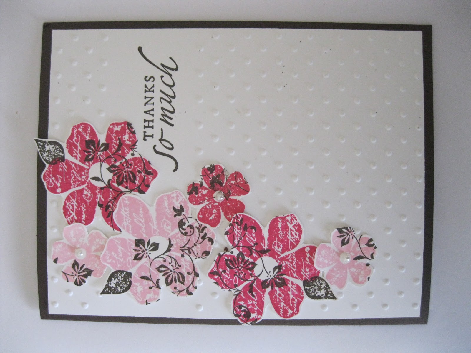
Wednesday, November 7, 2012

Christmas Cards Stamp Camp 2012

I love snowmen.  They are my favorite Christmas decoration theme.  This stamp set "Snow Much Fun" is just way too cute and had my name written all over it.  And when you see a set in the catalog that has your name written all over it, you have to buy it.  I'm just sayin'.   I also like can't resist adding glitter to snow cards like this one : ).

It was my daughter's idea to add the cute little bows to the gingerbread people.  This is the make and take card my workshop attendees get to make this month : ).

I can't make Christmas cards without including Christ!  I love the monotone color scheme here, even though they may be earthy tones (I wasn't sure about the brown-ness, but I love the way it makes Baby Jesus stand out). 
If you can't make it to my stamp camp (Sat. Nov. 10th 9:30 a.m. and Thurs. Nov. 15th at 7:30 p.m.) but would like to send out a few of these cards, I can make them for you--contact me for prices : ).

Merry Christmas everyone!


Friday, October 19, 2012

Good For a Laugh Stamp Camp

Who wouldn't love receiving this Goofy card in the mail?  This card has a hundred different pieces, but I think it is so worth putting them all together!  Can you guess how many different times we used the oval punch to make this card?  Thirteen! 
We are big Spongebob fans at our house, so I couldn't resist copying this card that I found online.  Believe it or not, it was slightly easier than the Goofy card (I think).  Isn't it fun?
Here are the quotes I found that I thought would work well inside the Spongebob card.
This is a funny frog that makes me laugh just to look at it. 
Here's the coordinating stamp some used inside the frog card.  I just left mine blank inside, because I didn't think it would be quite as funny for me to send that sentiment to a friend as it would for, say, my Mom to send it to someone.  Not that you're old, Mom, I'm just sayin'... ; ).
We didn't make this card at the camp this time, I just wanted to show you this design I modified, leading me to the frog card design.  I just love these two oranges together for some reason.  


I hope you have a chance to lighten someone's day with a laugh today!


Saturday, August 4, 2012

Evolution of a Card

This was the first version of today's featured design.  We made this at one of my stamp camps in Oregon.  I liked it a lot back then.  Now that it has evolved, this design doesn't look quite "finished" to me.  A few notable differences between this card and the future versions are:  1) I used the Big Shot for a polka dot background on all versions, but this one--created by a Textured Impressions plate-- is not as pronounced as the dots created by the Perfect Polka Dots Embossing Folder.   2) Obviously, the colors are different.  I like these colors, but this card still needs something shiny, or something, right?  The paper button plus Linen Thread seems a little dull.  3) The butterfly that is "popped up" with Stampin' Dimensionals here was cut out by hand.  This was before I owned the butterfly punch.  It's so much easier (and nicer!) with the punch!

Version 2: made at a stamp camp in PA.  Much improved!  Still nothing shiny, but the individual features here are much more pronounced and bright.  The colors are Springy and have a nice contrast, the polka dots are poppy, and the butterfly punch just helps add to the "professional finish" feel.  At least to me, it does : ).
Version #3:  We changed the colors once again here for a special occasion.  By "we," I mean one of my best neighbor friends and I.  She and I together made 30 of these, in the form of an invitation to her mother's 80th birthday party.  We left off the punched butterfly just for the sake of time--we made 30 of these in just a few hours and popped them in the mail just in the nick of time.  I thought it was a fun/nice touch the way we dyed the string on the flower center to match the little green flowers (by pressing and pulling the string across an ink pad).  The best part of this project was... that we also made party favors to match!
Here is the most recent version.  My favorite!  This card was also created for a special occasion:  it was a wedding gift.  I made 12 cards just like this for the bride and groom, in their wedding colors, yellow and gray.  These were left blank inside, so that they could send them as Thank You cards, or whatever they choose.  I loved being able to add the silver embossing and silver cord for a the shiny effect! 


 I hope you enjoyed observing this design's journey with me!


Saturday, July 21, 2012

June Stamp Camp: Summer All-Occasion

Masking + Sponging!  I had forgotten about this very simple but beautiful technique; it was fun to bring it out again.  My colors here are Pink Pirouette and Rich Razzleberry.  Believe it or not, this is a fairly quick card to make, and requires relatively few supplies : ).  Nice!
Another simple design that I love how it turned out.  Although, want to know a secret?  There are 3 elements here that I didn't add to the design until right before the stamp camp, and without those I just wasn't quite satisfied yet with the design.  Imagine my original design:  It was this same card without the brad, the linen thread, and the chalk on the grass.  Those three elements "MAKE" the card, don't you think?  I'm so glad I added them.  One other cool part of this design is the Big Shot  embossed print + white Craft ink (just brush the pad directly onto the embossed print). 

I love these "S'more" themed cards.  Let's see how many sayings we can come up with for the inside of this card.  How about these:  "Now I love you even s'more!", "Happy birthday, and many s'more!" "There's s'more to you than meets the eye!  Way to go!", or "Everytime I'm with you, you amaze me even s'more."  Can you think of any others that would work?


 I just want to say one more thing:  I LOVE MY STAMP CAMPS!!!  I feel so uplifted every time I get to share this time of creating with my good friends, even if it's with just a couple of people.  I still hope I can do this forever, until I'm too old to see or hold a stamp or something.  Stamping makes me happy, and stamping with friends makes me even happier.  Thanks to everyone who has ever stamped with me for filling my life with happy times!

Sunday, May 27, 2012

Father's Day Cards 2012


Notice the faint water-colored smoke sizzling out of the grill?  The greeting is embossed in black which adds a little extra shine to this summertime themed Father's Day card. 

Stampin' Pastels add the faint color tints to the bear images.  He's such a cute little guy!  He reminds us of all the fun, rough and tumble times dads bring about during our lives.  Even if your papa bear isn't roaring at little kids anymore, I bet he's still a lovable, huggable bear like this one.  I'm grrrrrrateful for my own papa bear!

I love the simplicity and somber tone of this Father's Day card--appropriate for any father or man on another special occasion.   There's something about the majesty of lions that reminds me of the things I love about my masculine men.  This card was also colored with Stampin' Pastels.
These cards are all available to order!  Just $3.50 per card includes my shipping to you.  I can always change the greeting words too, in case you need a masculine card for another occasion.  Just send me a note or leave a comment : )!

Mother's Day Cards 2012

There's just something special about this card that I can't put into words.  I love so many different elements of it though.  It was fun to design a Mother's Day card that didn't have the traditional "feminine" colors in it--because we all know that not every woman loves pink, right?  Or at least we don't all love pink ALL the time, so it's fun to change it up.  I enjoyed making the ruffles for this card with the ribbon punch--it was easy to ruffle it up after I crumpled and scrunched it up (the "card stock ribbon") in my hands for a minute.


I'm going to miss this Tote-ally Tess stamp set, which is being retired this month from our catalog.  She's such a pretty little stamped lady!  I was glad to get one more smile from her featured in a stamp camp, and I thought she'd be the perfect image to tell many of the mothers in my life of my admiration and gratitude for them!

(Sorry this one is tilted.)  Isn't this a pretty bunch of flowers from the Vintage Vogue set?  The pearls in the center add an elegant and fun extra polka dot element to the centers of the smaller flowers.

I wanted to show in this photo the gorgeous card under my finger tips that my cousin Radene made, which inspired my floral design.  Also here you can see how I used a Mother's Day greeting on the front of that card (my floral one) which I sent to my wonderful mother.  That was my camp for May...I'm grateful to all those who attended and enjoyed this stamping time with me! 

Tuesday, April 17, 2012

Spring is in the Air

MARCH STAMP CAMP 2012

I love these Spring designs!  I just had to have a stash of them for myself, so I stamped myself silly after the stamp camp, and this is what I got : ).  Lucky me!
I'm really having fun with this emboss resist technique lately.  The focal point here was created on white card stock:  I embossed the flowers with clear embossing powder (clear on white matched the white paper better than my white embossing powder on white paper).  Then I sponged the colored inks around the flowers, and stamped the French Script print in blue (Marina Mist) on top of the flowers as well.  Of course, the embossed flowers resisted all of the new ink.  This card looks so "soft" to me, I love it.

I did it--I made a card with yellow as one of the main colors.  Not an easy feat for me, but Springtime is just the right time for such an undertaking.  Combine Daffodil Delight with Almost Artichoke and Certainly Celery and with this, my favorite butterfly set, "Flight of the Butterfly", and I couldn't lose.    Isn't it Springy and happy?

I laugh now about how much I love butterflies because it makes me remember the time my mom and I were driving through town forever-ago, and when I saw some fake huge butterflies stuck to the side of someone's house, I thought that was the ugliest decoration I had ever seen.  And so Mom and I have laughed about butterflies ever since (no offense to the real ones that always make me smile when they fly by).  But now, I love using them in my creations, especially when they're little, or teeny-tiny like some of these!  This card design followed one that I found online, at least in part...but I changed a few things.  And, since I didn't have the cool designer series paper that the other artist used, I made my own!  The butterflies were die-cut from what was originally plain pink card stock (Regal Rose), which I decorated with my own stamps and ink (Elegant Eggplant, Rose Red, and White ink with Vintage Vogue images in a very "sloppy" random pattern).   I love these almost Christmassy colors made into a Spring theme.  (And I just love that teeny-tiny butterfly!)
I hope you enjoyed these designs, and feel inspired to create or send or give something Springy on your own!